
Clear versus opaque labels is a choice about what becomes part of the design. A clear background lets the container and contents contribute. An opaque background can create a more controlled area for the printed information, when the chosen process provides that coverage.
For product packaging, compare both looks on the filled container.
Quick answer: decide how much product you want visible, then check readability and the actual stock and ink options. A transparent file is not a guarantee of a specific printed opacity.
On this page
- Compare visible product and opaque coverage
- Check text against the filled container
- Confirm available ink and opacity options
- Choose with a side-by-side label sample
- FAQs
Compare visible product and opaque coverage
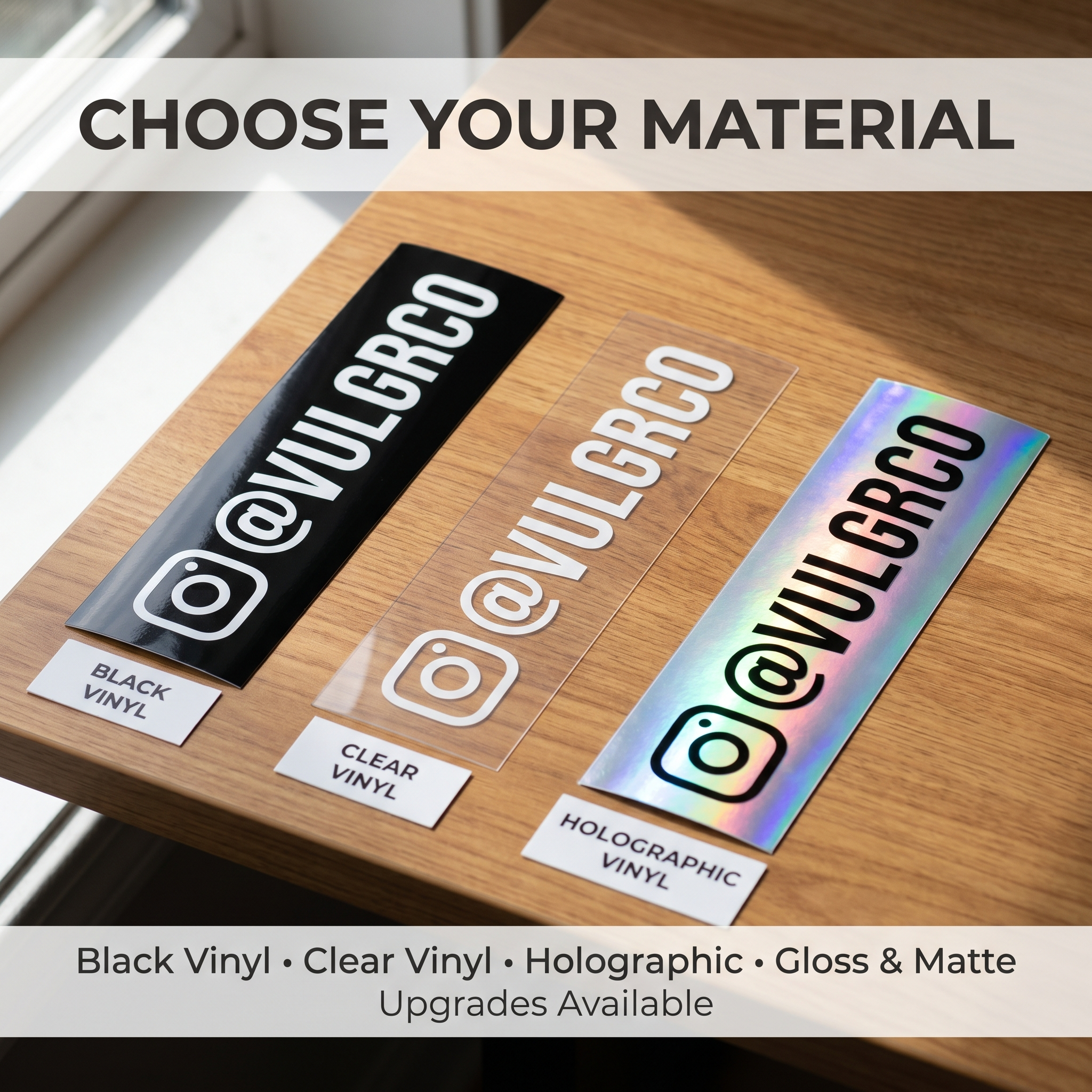
Clear labels can suit packaging where seeing the contents is part of the presentation. They may also create a quieter label outline against a smooth container.
An opaque-looking area can separate text from a dark or visually busy background. That can be useful for detailed information, but you need to confirm how the actual material and ink achieve it.
Do not assume every white element in your artwork will become solid white on clear stock. The production method determines the result.
Compare clear label options with the verified alternatives offered for your custom label project. Ask specifically about available opaque stock or ink treatment.
Check text against the filled container
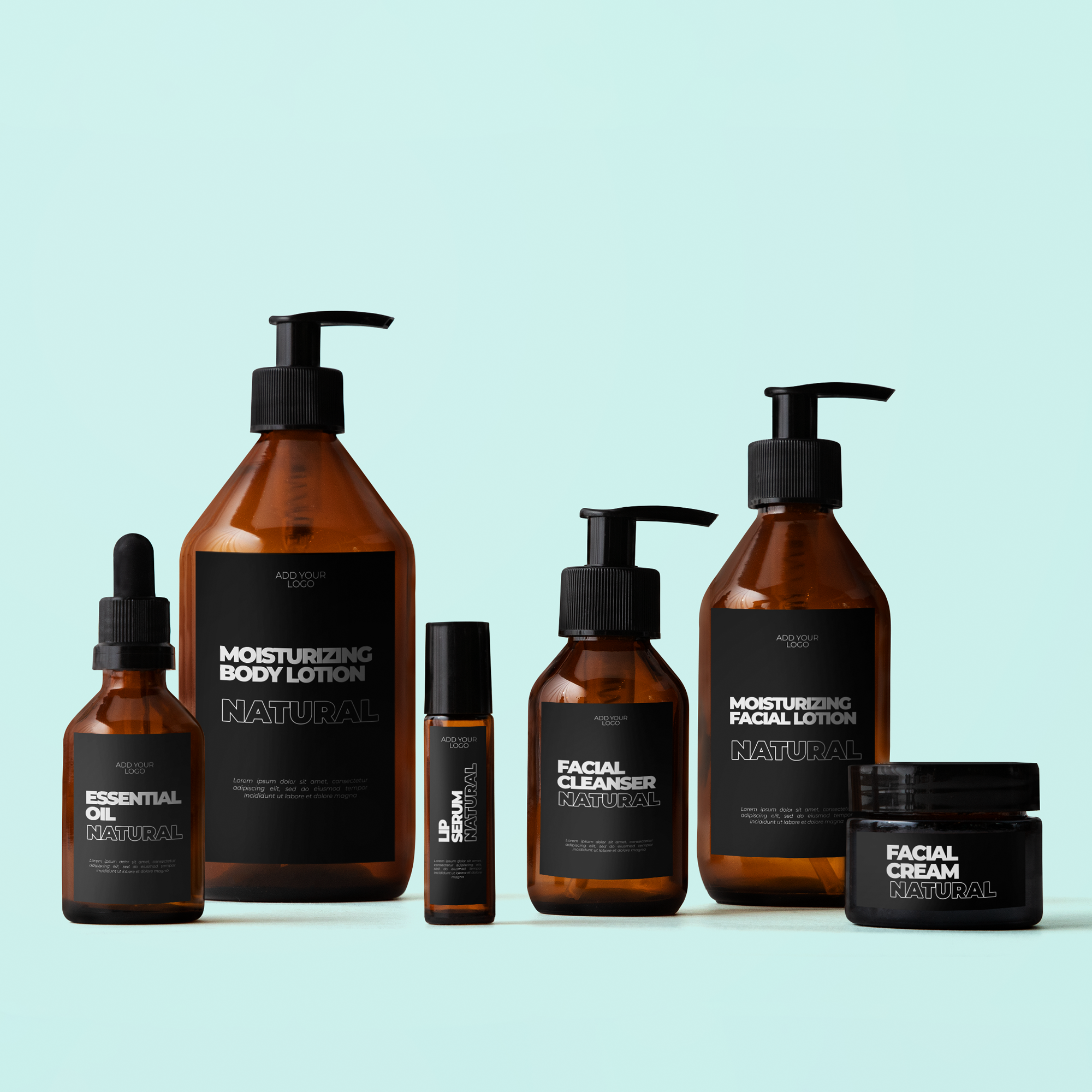
A clear jar can look very different when filled with a dark cream, colored liquid, or granular product. Use the product-ready package in the mockup.
Arrange the same information in both proposed versions. Keep text size and placement consistent during the first comparison. That makes it easier to see what the background changes.
Inspect from the front and side. Reflection and curvature can affect whether customers can read the design without repositioning the package.
If important text disappears, change the layout or background treatment. Do not shrink the font to fit a more decorative version.
Confirm available ink and opacity options
Ask a precise question: “I need this text area to remain readable over this filled container. Which verified stock or ink option can provide that result?”
An answer about holographic material does not establish clear-label capabilities. Each product's process needs its own confirmation.
List what you need from the label:
| Area | Intended result |
|---|---|
| Brand name | Readable at normal handling distance |
| Background | Clear, opaque, or a verified combination |
| Product information | Visible against the actual contents |
| Open area | Deliberately shows the container |
| Fine detail | Fits current production limits |
Keep those intentions in the production note. The print file itself should remain clean.
Choose with a side-by-side label sample
Use matched samples where possible. Compare the label on the actual container under the light customers will see.
A photograph is useful for discussion, but inspect the physical sample too. Reflections can make a single image misleading.
Before approval, check that the chosen print treatment matches the layout. If an opaque effect is not available through the selected option, choose a verified alternative rather than hoping the file will force the result.
The right background is the one that makes the product information and appearance work together.
FAQs
Can a clear label hide a dark liquid?
A clear background is intended to let the surface contribute; it should not be assumed to hide what is behind it. Any covering effect depends on the actual ink and stock. If hiding the contents is important, request a verified opaque solution.
When does an opaque label improve contrast?
It can help when the underlying surface varies, is dark, or competes with the text. Compare the actual design and available print treatment on a filled container. The useful result is readable information, not an assumption that opaque always looks better.
Will white artwork print white on a clear label?
That depends on whether the specific process uses an appropriate white or opaque treatment. Confirm it directly for the clear-label product. Do not infer the answer from a screen preview, an unrelated material, or another printer's capability.
Should I compare samples on a filled container?
Yes, when the contents affect the label's background or the package shape. Test under typical viewing conditions and inspect important text. An empty-container mockup may miss a contrast problem that appears once the product is ready for sale.