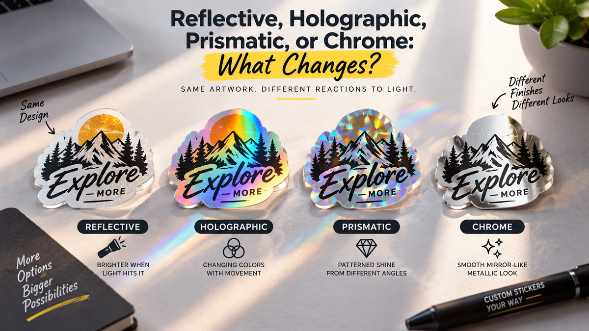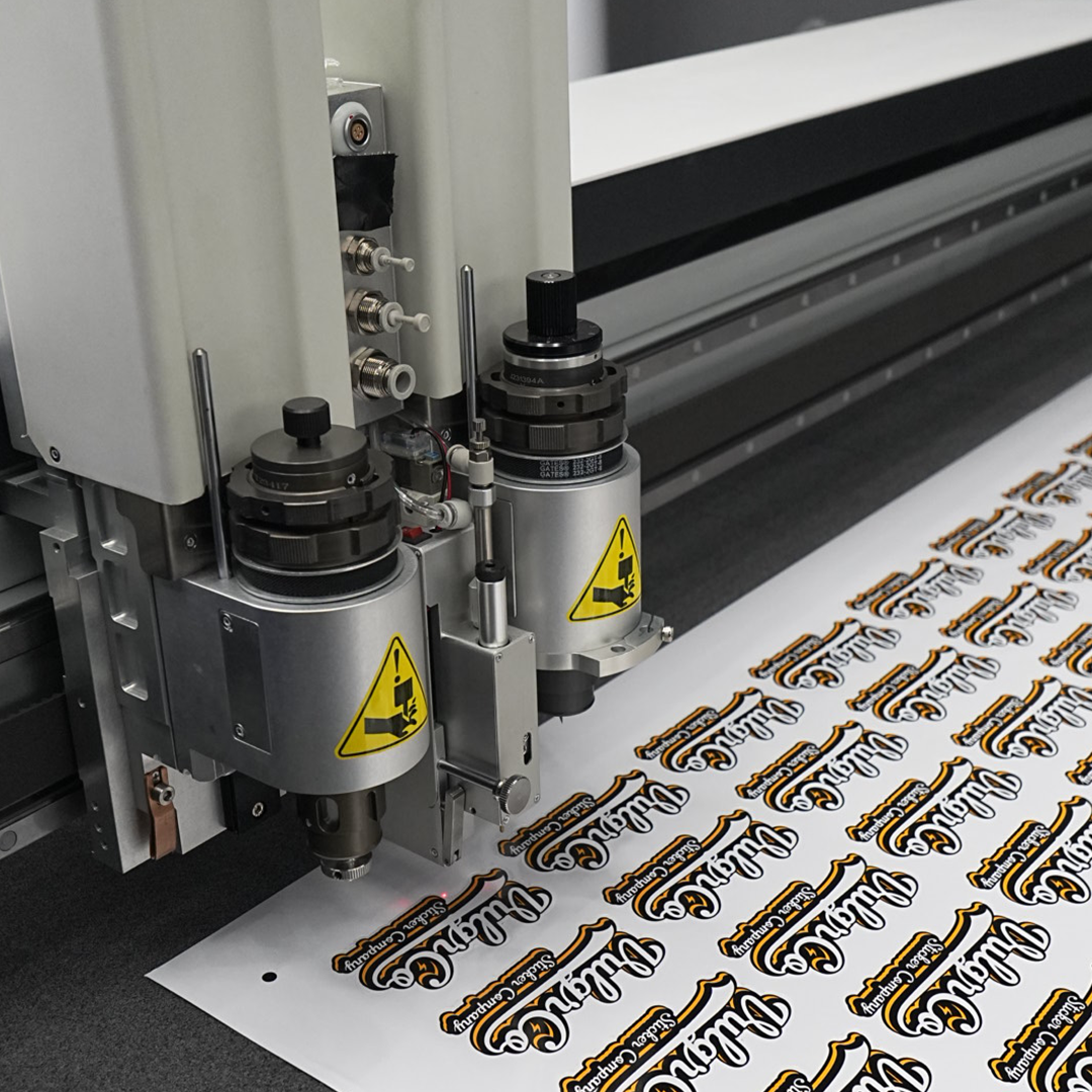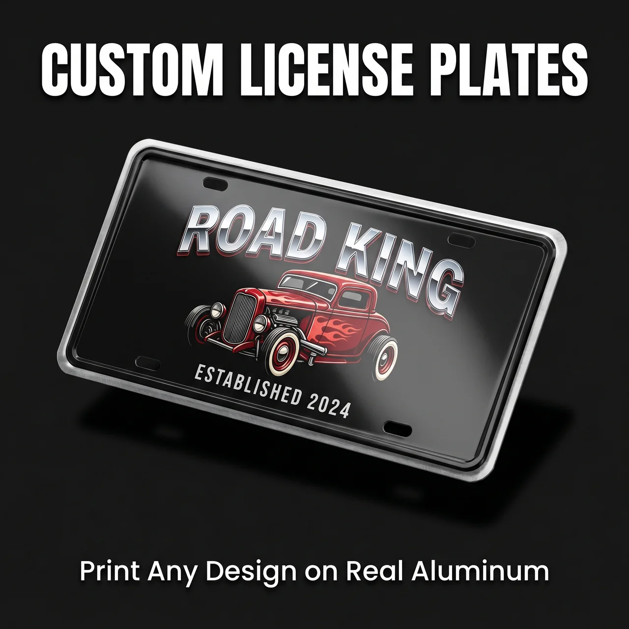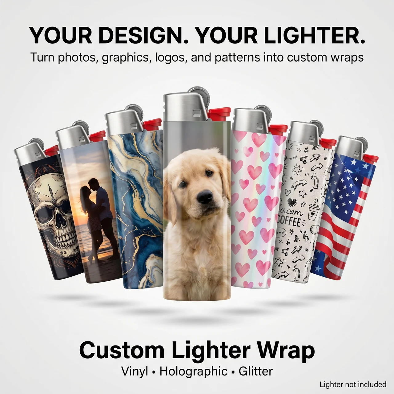

“Gold” identifies a color family, not one visual finish. Mirror, brushed, and glitter options can give the same artwork a different character.
Quick answer: compare real examples of the finishes, then check whether the smallest details remain readable on the selected material.
On this page
- Compare the three physical finishes
- Check fine text on each sample
- Match the finish to the use
- Choose from real photos and samples
- FAQs
Compare the three physical finishes
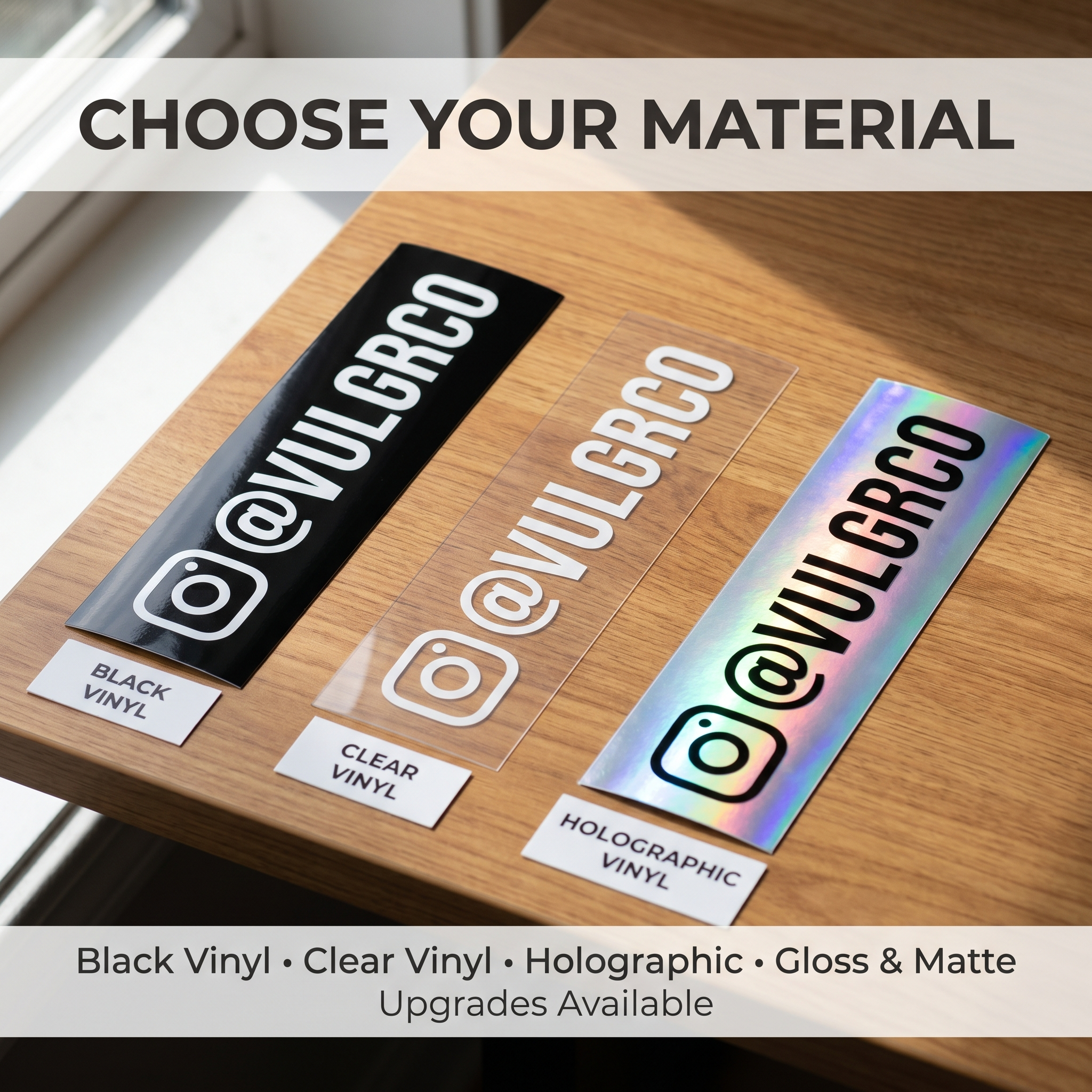
A mirror finish aims for a reflective metallic appearance. A brushed look emphasizes a directional metallic texture. A glitter look emphasizes sparkle.
Treat those as visual descriptions rather than quantified product performance. The exact printed result depends on the supplied material and artwork process.
A digital gold gradient is also different from choosing a specialty gold material. Confirm what is physically supplied.
Check fine text on each sample
Review gold mirror stickers when a reflective metallic look suits the design.
Compare lettering against the actual finish under more than one lighting condition. Fine text can interact with reflections or texture differently from a solid screen color.
Inspect the same artwork on representative samples where possible. Changing both the design and the material makes the comparison less useful.
Ask about white-ink treatment and how the print covers the material. Do not assume the rules for one finish apply to all three.
Match the finish to the use
Gold brushed stickers provide another visual option to review.
Choose around the intended effect. A restrained logo and a bold decorative graphic may benefit from different amounts of texture.
| Desired direction | What to compare |
|---|---|
| Reflective metallic emphasis | Mirror sample and viewing angle |
| Directional metallic texture | Brushed sample and artwork orientation |
| Sparkling decorative appearance | Glitter sample and detail visibility |
This table suggests comparison tasks, not a guarantee about how every design will look.
Confirm surface and exposure compatibility independently from appearance.
Choose from real photos and samples
Review gold glitter stickers using current product information and representative images.
Ask for a physical sample if the finish is central to the purchase. Photos help, but lighting, camera processing, and screens can change the apparent effect.
Prepare an artwork version with clear hierarchy and enough contrast. Review the actual proof before ordering a larger quantity.
Keep the selected finish and artwork version in the reorder record. “Gold logo” alone is not enough to specify the same result later.
FAQs
Are mirror, brushed, and glitter gold the same material?
Do not assume that. They describe different visual finish options and may have different construction or printing behavior. Confirm the exact product specifications and compare representative examples before treating them as interchangeable.
Is a gold color printed on white stock the same as gold mirror?
No equivalent appearance should be assumed. A printed gold-colored graphic and a specialty reflective material are different design choices. Check what the product actually supplies rather than judging from a screen's gold gradient.
Which finish is best for small text?
Compare the actual text at final size on representative samples. Reflections and texture can affect readability. There is no universal winner for every font and layout; simpler lettering and stronger contrast may be more helpful than changing finish alone.
Can I judge the finish from a product photo?
A photo is useful for orientation, but lighting and screen presentation can change the effect. Request a physical sample where appearance is critical. Check the proof and confirm artwork treatment separately from the sample's unprinted material.