
The best sticker material for different surfaces is the one that matches the actual job: where it sticks, how it is handled, and what it encounters. A beautiful finish on a flat sample is only the beginning.
Start with the object, then choose the look. This approach saves you from ordering a finish that photographs well but does not suit a curved bottle, painted panel, or frequently cleaned surface.
Quick answer: identify the surface and exposure, shortlist a finish, and test a sample on the real object before ordering a large run.
On this page
- Start with the surface
- Compare finish and visibility
- Match exposure to documented performance
- Use a sample before a full run
- FAQs
Start with the surface
Write down what the sticker will touch. “Plastic bottle” is useful; “brand packaging” is too broad. Smooth glass, textured plastic, unfinished wood, and a painted surface are different application situations.
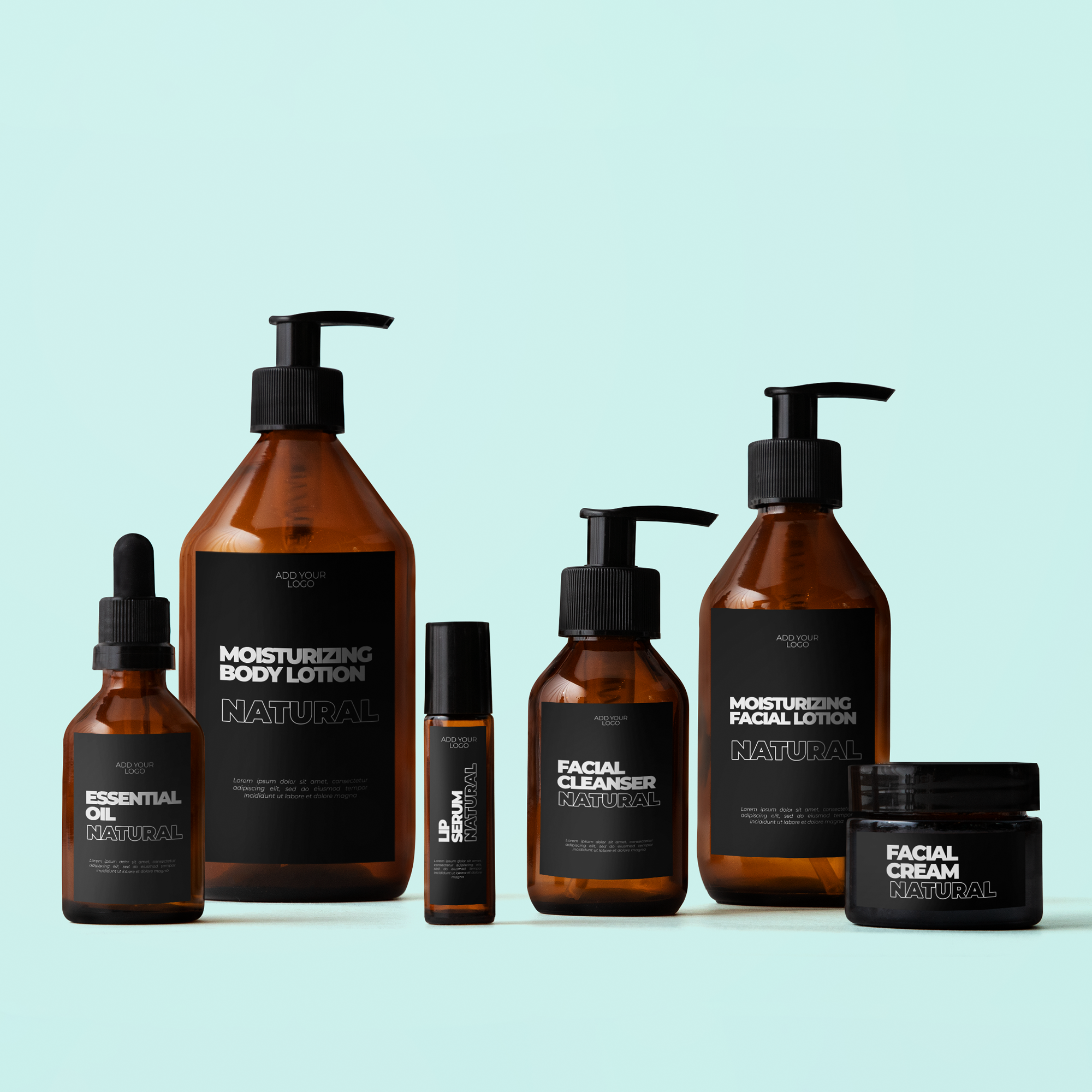
Measure curvature as well as available space. A wide design on a narrow bottle may wrap farther than expected, putting small text on the side. Raised seams or molded ribs can interfere with full contact.
Before choosing custom sticker options, make a short surface note:
- Object and surface material.
- Flat, curved, ribbed, or textured area.
- Application location and available dimensions.
- Any cleaning products or frequent handling.
- Whether eventual removal matters.
Photograph the empty application area. That gives the printer more useful context than a logo file alone.
Compare finish and visibility
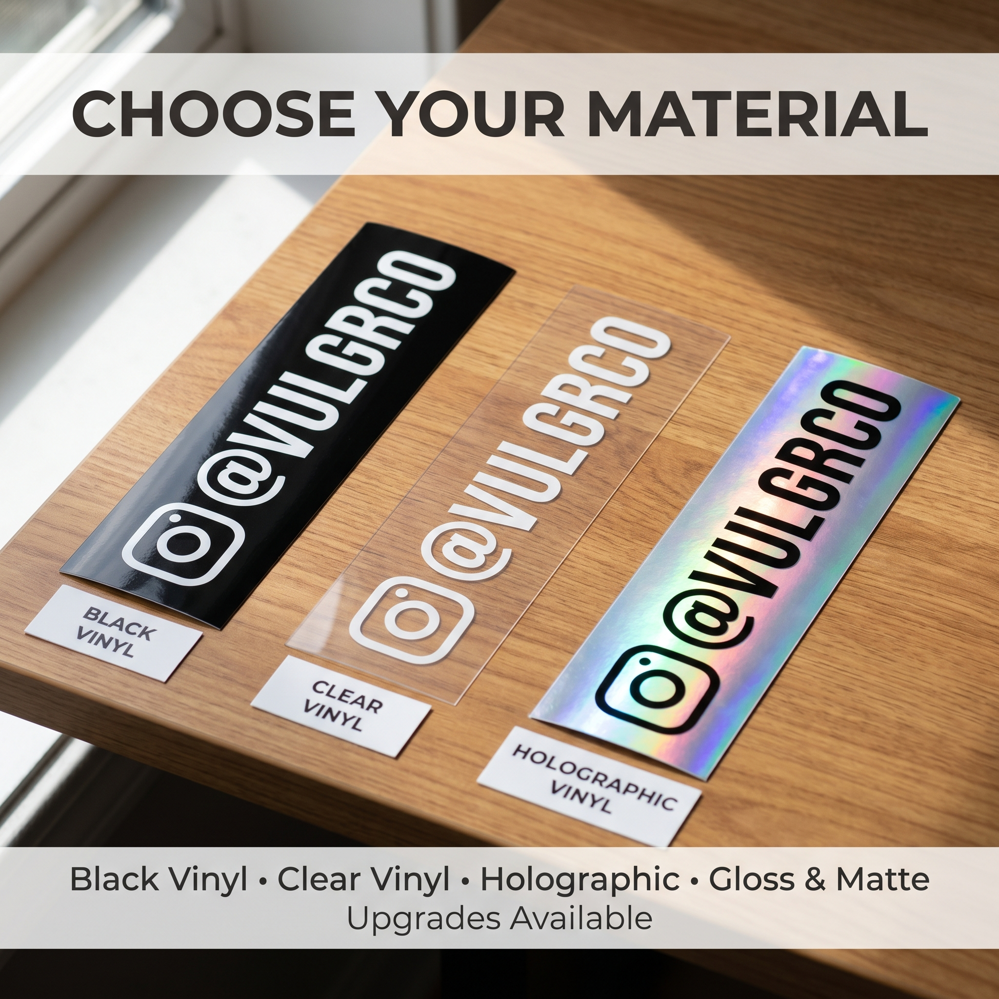
A finish changes how the artwork looks, not just how the product feels. A clear background lets the object contribute to the design. A metallic or holographic background adds its own visual effect. Matte and glossy appearances react differently to light.
Your headline should survive that effect. A dark logo might stand out on one sample and disappear against a dark container. Small text may be readable under soft indoor light and less obvious under a reflection.
Use the same artwork when comparing materials. Otherwise, a brighter design can make one finish seem better when you are really comparing two different layouts.
Keep ink capabilities separate from material names. The availability of white ink, opaque areas, or a particular finish must be checked for the specific product.
Match exposure to documented performance
Describe the exposure precisely. Occasional splashes are not the same as soaking. Hand washing is not a dishwasher cycle. A sheltered sign is not an outdoor item left in direct sun.
| Exposure | Ask for evidence about |
|---|---|
| Water | The tested conditions and any exclusions |
| Repeated cleaning | Suitable cleaners and handling instructions |
| Outdoor display | Material and print exposure guidance |
| Curved containers | Adhesive and application compatibility |
| Later removal | Surface-specific removal guidance |
A material's decorative name does not answer these questions. “Heavy-duty” is a reason to inspect the specifications, not permission to assume every environment is covered.
Use a sample before a full run
Use the Vulgrco material sample pack to compare what is actually supplied. Ask which finishes it includes if a specific material is central to your project.
Apply a suitable sample to the intended object using the approved preparation method. Check edges, bubbles, visibility, and handling after the normal activities the object experiences. Record the material and conditions so the comparison means something.
A useful test is small and specific. For a retail bottle, compare readability on the filled bottle and inspect after ordinary handling. Do not turn an informal test into a lifetime or safety certification.
Choose the material that meets the job first. Then refine the design around its appearance.
FAQs
Which material should I use on glass?
Start with the type of glass, shape, exposure, and desired appearance. A clear effect and an opaque-looking design solve different visual problems. Check the adhesive and cleaning guidance for the actual product, then test it on the glass item rather than assuming all glass applications behave alike.
What should I choose for curved plastic?
Measure the usable area and consider how far the sticker wraps around it. Ask about compatibility with the actual plastic and whether the design size suits the curve. A test on the real container is more useful than a flat sample alone.
Does a metallic finish affect readability?
It can change contrast as the viewing angle or light changes. Compare the same text and logo on real finish samples, including the conditions where customers will see them. If important information gets lost, simplify the artwork or use a different background.
When should I order a material sample?
Order a sample before a large run when the surface, finish, ink appearance, or exposure is unfamiliar. Use it to narrow options and ask focused questions. A sample helps you judge the material; it does not replace current product specifications or project-specific performance guidance.