
The best sticker size for a logo is the smallest size that still does its job clearly. That depends on the logo's shape, supporting text, placement surface, and how close someone will be when reading it.
A compact symbol and a detailed badge should not be sized by the same rule.
Try this first: print the design on ordinary paper at two candidate sizes, place each on the intended object, and inspect it without zooming.
On this page
- Measure the usable area
- Print a life-size mockup
- Check text and logo spacing
- Choose a shape that preserves the design
- FAQs
Measure the usable area
Measure the part of the object where the sticker can sit flat and remain visible. A container may have a large total surface but a much smaller usable panel between curves, seams, or raised details.
For a laptop, think about the planned arrangement. For packaging, consider whether the sticker will cross an opening or sit beside another label.
Write width and height together. “Three inches” is incomplete when the design is a long wordmark rather than a square.
The custom sticker builder is the ordering destination once the usable area and intended dimensions are clear. Do not let a convenient preset override what fits the object.
Print a life-size mockup
Create paper versions of the design and mark their dimensions. Cut them out and hold them in the real location. This quickly shows whether the logo is too dominant, too quiet, or wrapped out of view.
As an example, compare a two-inch symbol and a three-inch symbol on the same box. The larger one uses more space; it is not automatically better. If the box already has a bold product label, the smaller sticker may create a cleaner arrangement.
Check at the distance that matters. A sticker meant to be read while opening a parcel has a different job from a promotional message seen across a counter.
If another person cannot identify the main word promptly, simplify before making the design bigger.
Check text and logo spacing
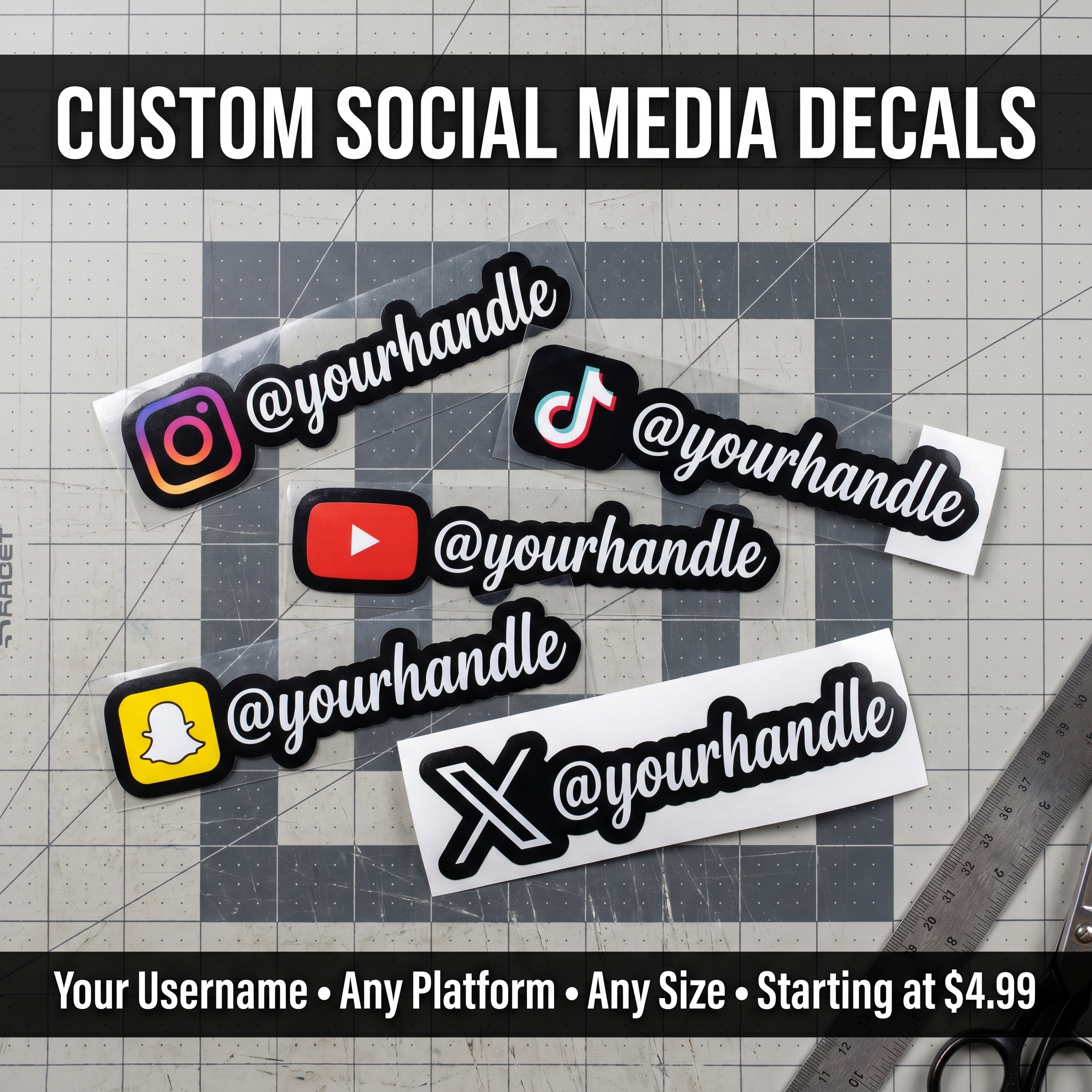
Small supporting text is often the first thing to fail. Social handles, taglines, and web addresses can turn an otherwise readable mark into a dense miniature poster.
Rank the information. Keep the name or symbol primary, then decide which secondary detail is genuinely useful. A tiny website nobody can read is not adding much value.
A QR code introduces a separate scan-testing requirement. If you are considering QR and logo stickers, test the code at the chosen printed size with real devices. Logo legibility and scan reliability are different checks.
Ask for the printer's current text and detail guidance instead of assuming there is one minimum size for every font.
Choose a shape that preserves the design
A circle can suit a compact emblem. A wide wordmark may need a rectangle or a custom outline. Cropping a long logo into a round format can force the text to shrink.
Leave intentional breathing room. A border that is visible in the finished sticker can help separate a busy outline from the object beneath it, but it also affects the overall dimensions.
Before approving the proof, compare it with your paper mockup. Check that the finished shape, height, and width still match the usable area.
Order around the actual job. The familiar size in a dropdown is only a starting option.
FAQs
How small can my logo be?
That depends on its details, font, contrast, material, and viewing distance. A simple symbol can usually be considered at a smaller size than a detailed badge, but the actual print limits must be checked. Use a full-size mockup and current production guidance.
Should I measure the backing or the sticker?
State the intended applied sticker dimensions first. Backing size can be different, especially when extra backing surrounds the sticker. Check what the ordering controls measure and ask for clarification if the proof or cut treatment uses a different dimension.
What size works for a laptop?
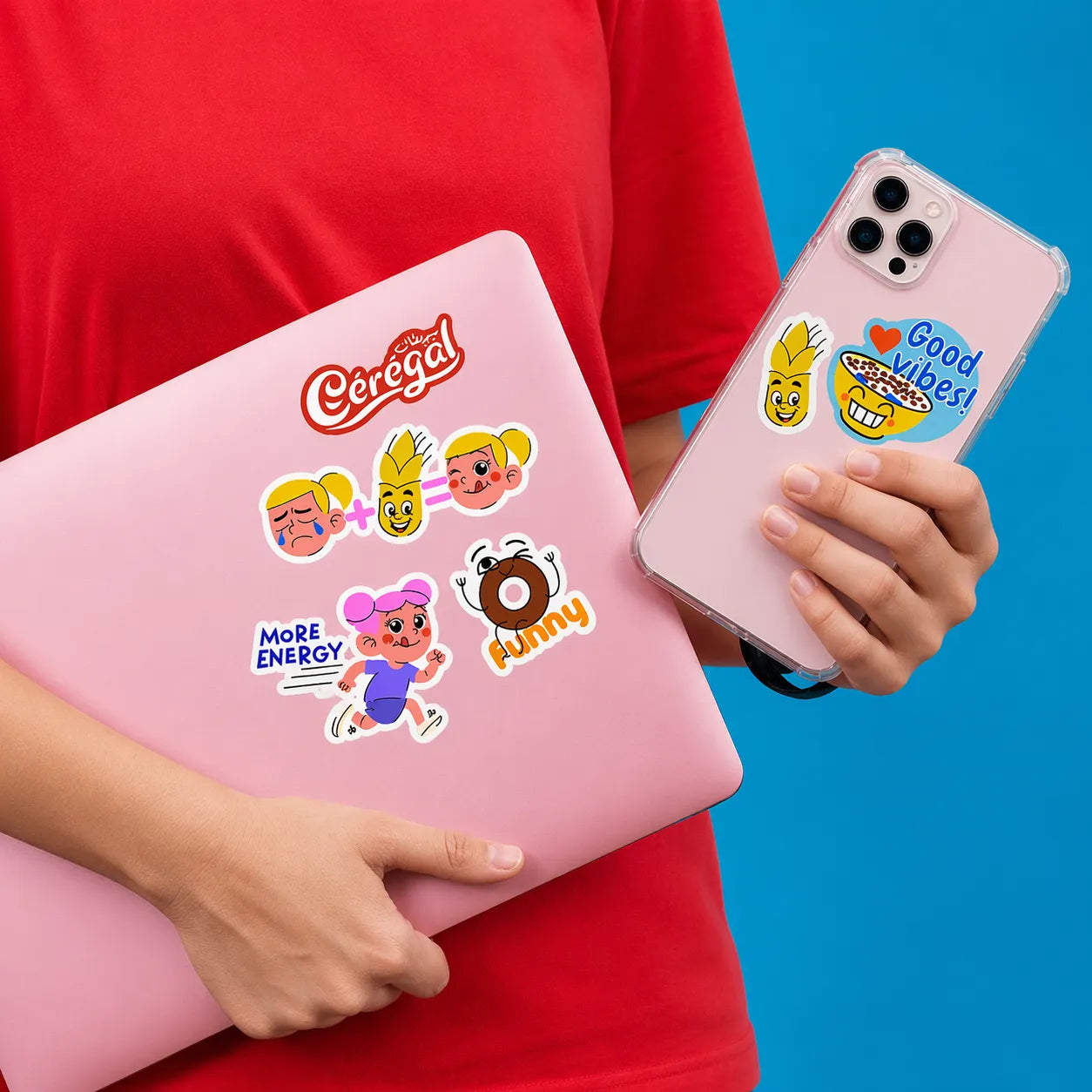
Measure the space you want to use and compare paper mockups. Think about nearby stickers, the device's edges, and the main word's readability. There is no single size that suits every laptop layout or logo shape.
Do complex shapes need more space?
They may need simplification or larger dimensions to keep narrow details and small gaps practical. Making a complex design bigger is not the only solution. Ask about cutting limits and compare a simplified outline before approving production.