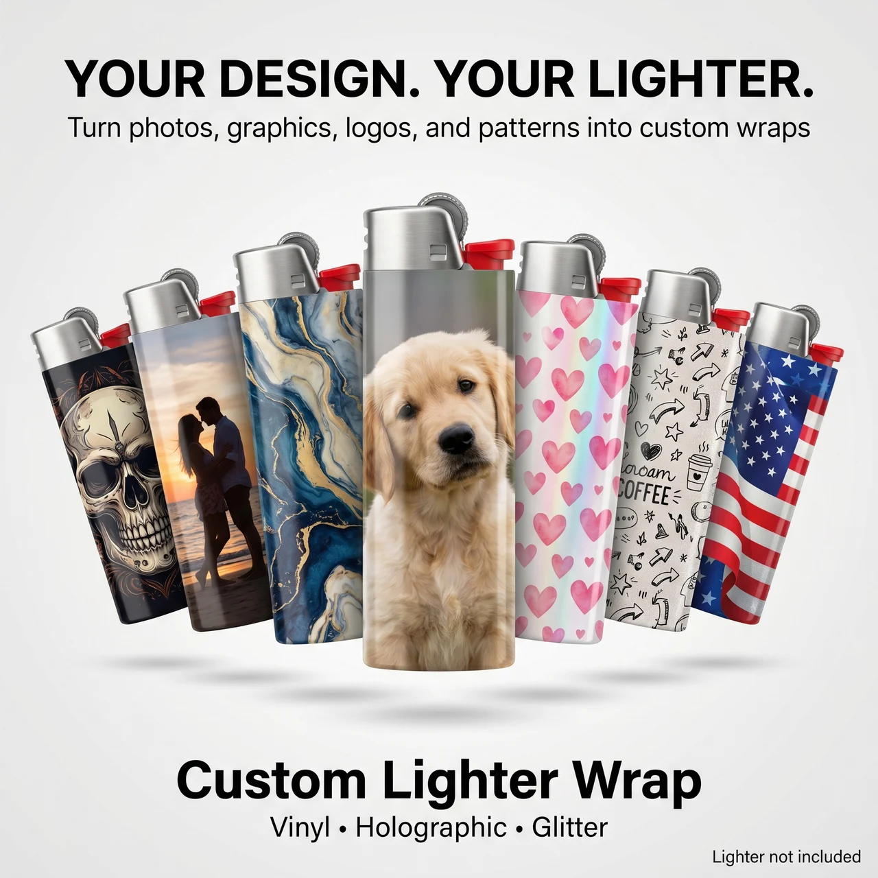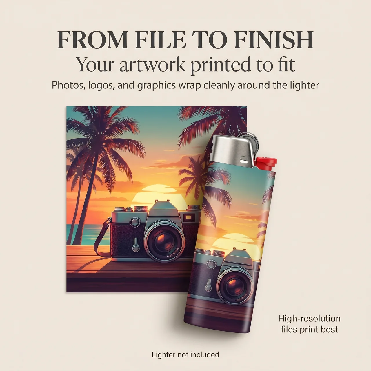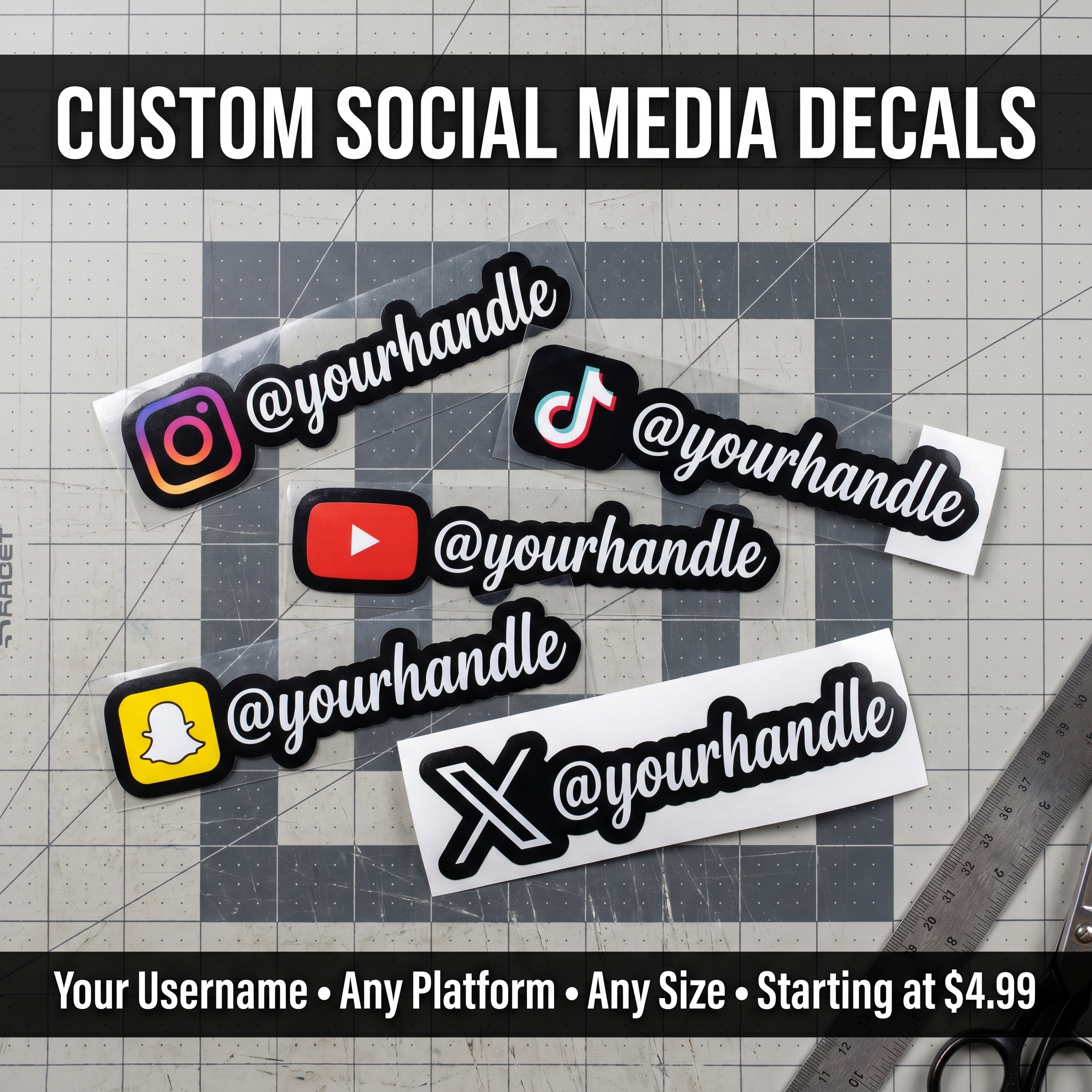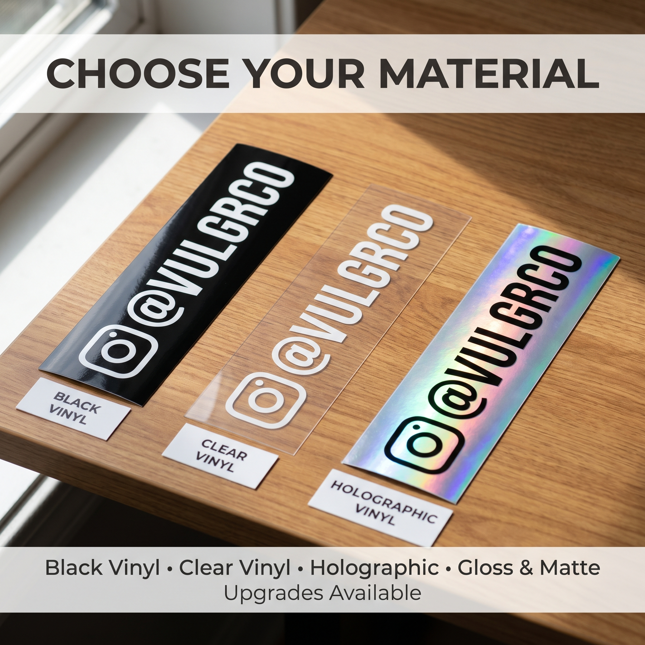

Matte versus glossy stickers is largely an appearance decision, but the right choice depends on where the design will be seen. A shiny finish can catch the light. A lower-glare appearance can make a text-heavy design easier to inspect under some lighting.
Neither label alone tells you everything about durability, adhesive, or print color. Compare the actual finished material.
Start here: use one design, one size, and matched lighting. That gives you a finish comparison rather than a contest between different artwork.
On this page
- How glare changes a design
- How color looks on each finish
- Which projects suit each finish
- Review a side-by-side sample
- FAQs
How glare changes a design
A strong reflection can cover part of the artwork from a particular viewing angle. On a decorative sticker, that may be part of the effect. On a tiny instruction label, it can be inconvenient.
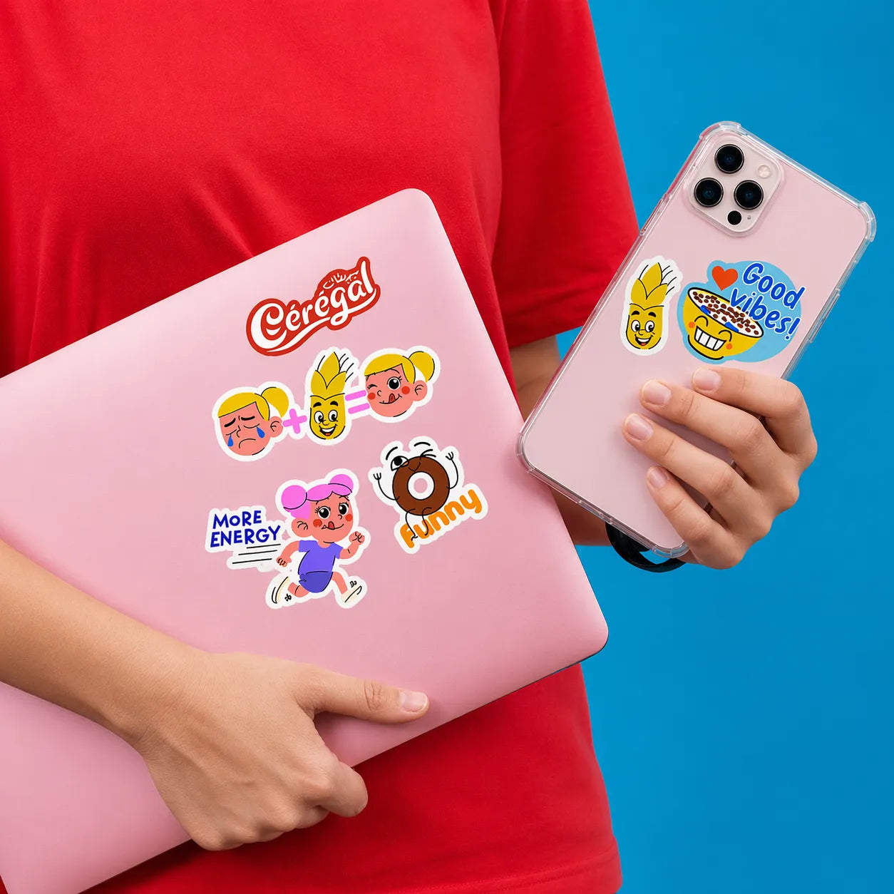
Think about the viewing situation. A laptop sticker is seen from nearby and different angles. A product label on a bright retail shelf may need a customer to read several lines without moving the container around.
Vulgrco has a dedicated matte sticker listing. Compare it with the actual alternative you want, rather than assuming every standard vinyl option has the same surface finish.
How color looks on each finish
Screen previews do not show physical surface reflections reliably. They also do not establish the printed color you will see on a material.
Choose a sample image containing a dark area, a light area, a midtone, and the smallest text used in your design. Look at the samples together under ordinary room light and the light where the sticker will normally be used.
Avoid editing one version to be brighter during the first comparison. Keep the files identical, then decide whether the chosen finish needs an artwork adjustment.
If a brand color is important, ask how the printer handles color expectations and proofs. A physical reference is more useful than a claim that your display is showing the “true” color.
Which projects suit each finish
The decision can be practical:
| Project | Comparison worth making |
|---|---|
| Small text or instructions | Glare across the text at reading distance |
| Illustration merchandise | Surface effect on shadows and highlights |
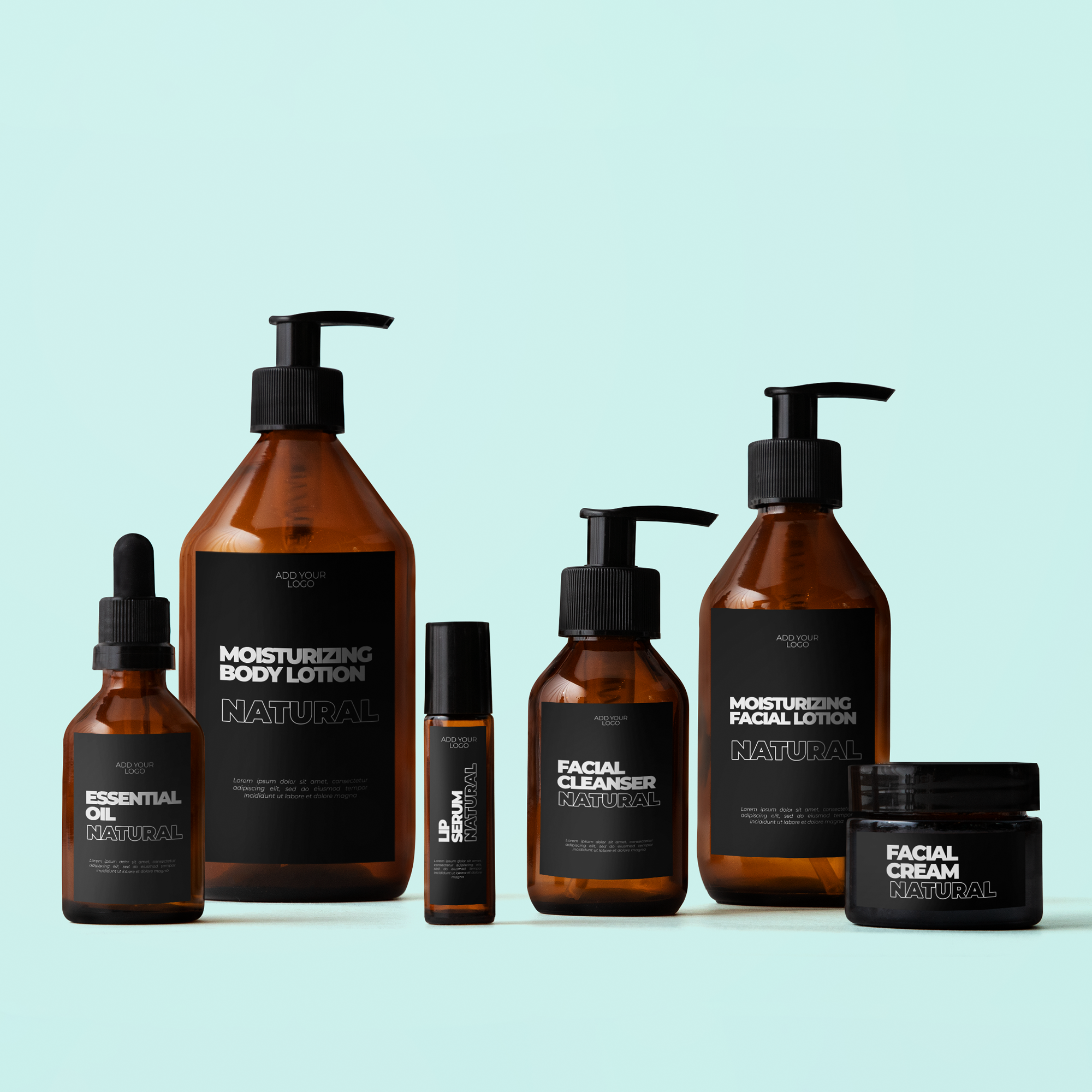
| Packaging | Appearance against the actual container |
| Giveaway stickers | How the design looks in typical indoor and outdoor light |
A glossy appearance may suit a bold image because you want the surface to be noticeable. Matte may suit a quieter visual style. Those are design preferences, not universal performance rankings.
When considering vinyl stickers, confirm the current finish rather than interpreting “vinyl” as a synonym for “glossy.” Vinyl describes a material category; the product's coating or finishing still matters.
Review a side-by-side sample
Before choosing, answer three questions: can the message be read, does the finish fit the visual style, and are its documented use limits appropriate?
Photograph both samples from the same angle, then inspect them directly. A camera can make one reflection look dramatic, so do not let a single photograph decide the whole comparison.
After choosing, check the final proof for text spacing and contrast. The finish should support the message. If the design only works under one carefully arranged light, simplify it.
FAQs
Does matte look less colorful?
It can look different from a shinier finish, but “less colorful” is not a useful universal rule. Compare the same printed artwork on actual samples. Color appearance depends on ink, material, coating, lighting, and the image, not just the word matte.
Which finish is easier to read in bright light?
A lower-glare appearance may help in some viewing conditions, but the layout and contrast still matter. Test the final-size design under the actual light. Large clear text on a glossy sample may outperform tiny low-contrast text on a matte one.
Can the same artwork use both finishes?
Often the artwork concept can be compared across finishes, subject to the printer's actual options. Start with matching files for a fair comparison. Once you select a finish, review whether the design needs adjustments for that specific printed appearance.
Does finish alone determine durability?
No. Surface appearance does not establish adhesive suitability, outdoor performance, cleaning limits, or resistance to wear. Check the full product guidance. Choose the look and the application performance as related but separate decisions.